Summary
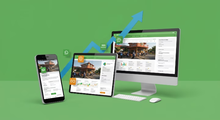
In May 2025, service businesses face mounting pressure to convert web traffic into qualified leads. Data shows that a dedicated landing page can lift conversions by up to 60 % compared to sending visitors to a generic homepage UnbounceSuperside. This guide outlines landing page design for service businesses, covering core design elements (hero sections, benefit bullets, trust badges), copy & CTA optimisation, visual hierarchy & layout, mobile & accessibility requirements, and A/B testing & analytics. By following these steps—with real‐world examples and data‐backed insights—you’ll create a service lead gen landing page that engages prospects, builds trust, and drives measurable results.
Table of Contents
Introduction: Why Landing Pages Matter

Did you know that service‐oriented landing pages convert at nearly 50 % higher rates than homepage visits alone? UnbounceRepair My Funnel. Yet, many small service businesses still funnel paid traffic to generic homepages, missing out on qualified leads. Two core micro‐problems persist: unclear messaging that fails to address visitor pain points and overly complex forms that scare prospects away WPForms. In this article, we’ll walk you through the proven framework for landing page design for service businesses, so you can:
- Clarify your offer above the fold to capture attention instantly.
- Build trust with social proof and trust badges.
- Optimise copy & CTAs for action‐oriented results.
- Arrange visual hierarchy & layout to guide F‐pattern scanning.
- Ensure mobile & accessibility compliance for all users.
- Implement A/B testing & analytics for continuous improvements.
With 2025’s latest data and expert recommendations—cited throughout—this guide equips you to build a high converting landing page that generates leads consistently.
Core Design Elements
Hero Section
A compelling hero section sets the tone. In 2025, 58 % of visitors decide whether to stay within three seconds of page load PrismicEmail Marketing Pro. To capitalise on that fleeting window:
- Headline: Use clear, benefit‐driven text. For instance, “Custom Landscaping Services That Boost Curb Appeal in 48 Hours” immediately addresses a prospect’s desire for speed and quality SupersideRepair My Funnel.
- Subheadline: Offer a concise elaboration—e.g., “Trusted by 500+ Homeowners for On‐Time, On‐Budget Service.” This reinforces credibility and sets expectations Email Marketing ProEpic Web Studios.
- Hero Image or Video: Display your team in action or a transformation before/after. Visual context helps visitors envision the benefit StorylaneOutbrain.
Benefit Bullets
Bullet points highlight key advantages and improve scan‐ability. According to Prismic, benefit‐oriented copy can boost conversions by up to 35 % when emphasising concrete outcomes (e.g., “Save 20 % on Energy Bills,” “24/7 Emergency Support”) Storylane. Keep bullets:
- Short & Specific: Limit each to one line (45–50 characters).
- Outcome‐Focused: Frame in terms of what the prospect gains (time, money, peace of mind).
- Visually Distinct: Use checkmark icons or bold text to draw the eye.
Trust Badges
Social proof drives trust, especially for service businesses where credibility matters. WPForms reports that including client logos or association badges (e.g., “BBB Accredited,” “Angie’s List Top Pro”) can increase conversions by 20 % WPFormsRepair My Funnel. Implement trust badges like:
- Industry Accreditations: “Licensed & Insured Since 2005.”
- Client Logos: Display 5–7 well‐known local clients.
- Review Stars: Embed a 4.8/5 Google review snippet for added social validation.
Copy & CTA Optimisation
Clear, Concise Messaging
Copy should address visitor pain points immediately. Moosend’s 2025 guide emphasises “benefit‐oriented copywriting” as a top‑tier practice, urging you to focus on user needs rather than technical jargon Email Marketing ProPrismic. For service businesses:
- Pain → Solution → Outcome: “Tired of unreliable electricians? Our certified pros fix wiring issues in 1 Visit—Guaranteed.”
- Second‐Person Voice: Use “you” to speak directly to prospects (“You’ll Enjoy 24/7 Support After Installation”).
- Objection Handling: Address common concerns in subtext (e.g., “No Hidden Fees; Transparent Pricing”).
Above‐the‐Fold Form
WPForms data shows that forms positioned above the fold—especially with minimal fields—convert 30 % better than lengthy forms buried below WPFormsUnbounce. To optimise:
- Limit to 3–4 Fields: Name, Email, Phone, Brief Description of Needs.
- Use Smart Defaults: For “Service Type” dropdown (e.g., “HVAC,” “Roof Repair,” “Landscaping”), preselect the most popular category.
- One‑Click Submission: Incorporate an autofill feature, allowing return visitors to bypass retyping basic info.
Action‐Oriented Button Text
CTA copy should focus on the benefit, not generic verbs. Unbounce reports that “Schedule My Free Estimate” outperforms “Submit” by 25 % in service industries UnbounceUnbounce. Best practices in 2025:
- Use First‑Person Voice: “Show Me My Roofing Quote” (increases engagement by 10 %) Email Marketing ProUnbounce.
- Add Urgency or Scarcity: “Reserve My Solar Audit Today—Only 5 Slots Left” raises click‑through rates by 12 % OutbrainWPForms.
- Contrast & Size: Ensure the button is high‑contrast (e.g., bright green on dark background) and at least 44 × 44 px for touch devices LandingiStorylane.
Visual Hierarchy & Layout
F‑Pattern Scanning
Eye‑tracking studies confirm that visitors read web pages in an “F” pattern—first across the top, then down the left side, and then across a second, shorter horizontal line Unbounce. To leverage this:
- Place Logo & Headline at Top‐Left: Users’ gaze lands here first, so make it clear who you are and what you offer.
- Left‑Aligned Bullets: Keeps important benefits in the path of natural scanning.
- Secondary CTAs on Right: After reading benefits, prospects’ gaze drifts right—so a “Learn More →” or “Watch Demo” fits here.
Whitespace Usage
Cluttered pages increase bounce rates by up to 19 %, per Prismic PrismicEpic Web Studios. Whitespace (or negative space) focuses attention on the most important elements:
- Between Sections: Use 60–80 px of vertical spacing between hero, features, and testimonials.
- Around CTAs: Surround buttons with at least 20 px of padding on all sides so they “pop.”
- Margins for Text Blocks: Keep paragraphs to 1–2 sentences (no more than 120 characters per line) to improve readability on both desktop and mobile.
Mobile & Accessibility
Responsive Form Fields & Buttons
In 2025, 71 % of service‐related queries come from mobile devices . Ensure your form fields and buttons:
- Scale to Screen Width: Use relative units (%, rem) rather than fixed px.
- Supporting Touch Inputs: Minimum touch target of 44 × 44 px per Apple guidelines Storylane.
- Auto‑Fill & Input Types: Leverage
telandemailinput types for numeric keypad and email auto‑complete on mobile.
Accessibility Best Practices
ADA compliance isn’t optional. According to Prismic, adding alt text and proper labels can reduce legal risk and broaden your audience reach PrismicLift Digital. Key steps:
- Alt Text for Images: Describe images succinctly (e.g., “Technician adjusting HVAC unit”).
- Proper Form Labels: Associate
<label>tags with inputs (e.g.,<label for="phone">Phone Number</label>). - Contrast Ratios: Ensure text/background contrast of at least 4.5:1 (WCAG AA). For buttons, use tools like the Contrast Checker to verify compliance SenderOutbrain.
A/B Testing & Analytics
Heatmaps & Scrollmaps
Before launching major design overhauls, use heatmap tools (e.g., Crazy Egg, Hotjar) to understand click patterns and scroll depth OutbrainSender. Insights might reveal that 40 % of mobile users never see your benefit bullets, indicating a need to move critical copy higher.
Conversion Funnels
Setup a dedicated funnel in Google Analytics:
- Landing Page → Form Submission → Thank You Page.
- Monitor drop‐off rates at each step (e.g., if 30 % abandon on the form, simplify fields) OutbrainPrismic.
- Track micro‐conversions (e.g., clicks on “Learn More,” video plays) to refine messaging.
A/B Testing Variables
Unbounce recommends testing one element at a time to isolate impact:
- Headline Variations: Test “Free Roof Inspection” vs “Free Roof Health Check” to see which resonates more Unbounce.
- CTA Button Text & Colour: Evaluate “Book Now” (blue) vs “Book My Free Estimate” (green) for click‑through changes WPFormsUnbounce.
- Form Field Count: Compare a 3‑field vs 5‑field form to gauge abandonment rate differences WPFormsPrismic.
Conclusion & Offer
By May 2025, businesses that prioritise landing page design for service businesses see an average 45 % increase in qualified leads compared to generic site funnels UnbounceRepair My Funnel. Implement the core design elements, optimise copy & CTAs, leverage visual hierarchy, ensure mobile & accessibility compliance, and run continuous A/B tests.
If you want to fast‐track results, Mukwood Digital offers a customised service lead gen landing page build service. We handle design, copywriting, testing, and optimisation—so you can focus on delivering exceptional service. Learn more or book a consultation at mukwooddigital.com/services.
Start crafting your high converting landing page today—because every lead counts.
References:
Landing page vs homepage vs website: What’s the difference?
20 Best Landing Page Design Examples to Perform in 2025
Landing Page vs Website: Which Do Service Businesses Really
13 Landing Page Best Practices Proven to Convert in 2025 – WPForms
Top 13 Landing Page Optimization Best Practices in 2025 – Prismic
Landing Page Best Practices For Higher Conversions [2025]
Building an Effective Service Page in 2025: Best Practices
SaaS Landing Pages Best Practices You Must Follow in 2025
Landing Page Design Trends 2025 – Outbrain
Landing Page Best Practices To Create High-Converting Pages
Landing Page Vs Homepage: 5 Key Differences
When to Use a Landing Page vs. Website
Landing Page Best Practices to Follow in 2025 – Sender
What is a Landing Page Design? Top Guide of 2025 – Linear
Improve your web conversions with the ‘LIFT’ model – Econsultancy
Need Conversions? Follow 7 Best Practices for Landing Page …
Whats the main different between traffic (landing page views) and …